
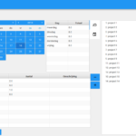
In the previous posts I have blogged a lot about the ‘one code base’ application that runs on all popular platforms, from desktops like PC and OSX, mobile like Android and iOS, and finally on web with the use of JPro’s brilliant library. The core of that application was the fact that depending on the available screen size, or better: scene size, a different layout was automatically selected. Below on the left the MigPane based layout for desktop, on the right the same controls put into a TabbedPane for mobile.
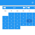
Beside changing the actual layout, also a different stylesheet was automatically loaded, so (for example) the arrows in the data picker became more touch friendly. This worked perfectly, even dynamically adapting as you resized the application while running on the desktop or in a web browser. However, the code for doing this adaptive layout was intermixed in the application, and I decided to extract it into a layout manager called ResponsivePane.
Before telling some more about ResponsivePane I want to take a short detour. Lately there are many attempts at making JavaFX applications become ‘responsive’. Not long ago there has been a crowd funding campaign to fund a CSS3 FlexBox-alike layout manager for JavaFX. And GUI Garage created ResponsiveFX, porting Twitter Bootstrap’s layout logic. I believe that these implementations are based on a wrong assumption: layouts for websites usually take a width, and then assume unlimited vertical space (by allowing the webpage to scroll down).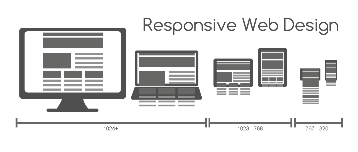
While this is fine for websites, I have never seen an application use such a layout. An application almost always stays within the confines of the screen and uses dynamically sizable controls to adapt. Take for example the webbrowser you are using to read this page: it probably fills your screen, or at least part of it, but it uses a webview control to render this page. And that control has a scrollbar, not the webbrowser itself!
So ResponsivePane does not assume unlimited vertical space, and thus does not base itself solely on the width of the screen to decide what layout and stylesheet to use. It takes both width and height into account, by using the screen diagonal, just like when you talk about physical screens: a 4 inch phone, a 27 inch monitor, …
And yes, the size is specified in inches, because using pixels is inaccurate: old fashion displays have around 100 pixels per inch, but retina displays go up to 300 or even more. Which means showing a line of 300 pixels on an old display equals to 3 inch what the user actually sees, but on a retina he sees only 1 inch. ResponsivePane detects the pixels-per-inch of the monitor where the application is displayed on, and adapts accordingly (or at least as well as it can).
Okay, enough detour, back to ResponsivePane. It has three main concepts:
- A repository of reusable nodes; these are nodes like TableView that are reused between layouts. After all, you do not want to create a separate TableView for each layout.
- A list of layouts, each with a sizeAtLeast property; the best fitting layout is selected and shown.
- A list of stylesheets, each with a sizeAtLeast property; the best fitting stylesheet is selected and loaded. Actually there are two stylesheet lists; one for the scene and one for the pane.
In pure Java a ResponsivePane setup could look like this:
ResponsivePane responsivePane = new ResponsivePane();
// nodes
responsivePane.addReusableNode("CalendarPicker", new CalendarPicker());
responsivePane.addReusableNode("save", new Button("save"));
responsivePane.addReusableNode("saveAndTomorrow", new Button("saveAndTomorrow"));
// layout
responsivePane.addLayout(Device.PHONE.size(), createPhoneLayout());
responsivePane.addLayout(Diagonal.inches(12.0), createDesktopLayout());
// css
responsivePane.addSceneStylesheet(Diagonal.inches(4.0), resource("phone.css"));
responsivePane.addSceneStylesheet(Diagonal.inches(6.0), resource("tablet.css"));
responsivePane.addSceneStylesheet(Diagonal.inches(12.0), resource("desktop.css"));
Where the layouts methods would be using the Ref class to include one of the reusable nodes: new Ref(“save”). Notice the use of Ref in the FXML example below:
<ResponsivePane xmlns:fx="http://javafx.com/fxml" fx:id="responsivePane" debug="true" trace="false">
	<reusableNodes>
		<Label text="refLabel" id="label"/>
		<Button text="refButton" id="button"/>
	</reusableNodes>

	<layouts>
		<Layout sizeAtLeast="3.0in">
			<VBox>
				<Ref to="label"/>
				<Label text="layout_3.0"/>
			</VBox>
		</Layout>

		<Layout sizeAtLeast="width:3.0in">
			<HBox>
				<Ref to="label" id="labelid"/>
				<Ref to="button"/>
				<Label text="layout_width3.0"/>
			</HBox>
		</Layout>

		<Layout sizeAtLeast="TABLET">
			<HBox>
				<Ref to="label" id="labelid"/>
				<Ref to="button"/>
				<Label text="layout_tablet"/>
			</HBox>
		</Layout>
	</layouts>

	<sceneStylesheets>
		<Stylesheet sizeAtLeast="3.0in">  <URL value="@phone.css"/> </Stylesheet>
		<Stylesheet sizeAtLeast="width:3.0in"> <URL value="@desktop.css"/> </Stylesheet>
		<Stylesheet sizeAtLeast="TABLET"> <URL value="@tablet.css"/> </Stylesheet>
	</sceneStylesheets>

	<myStylesheets>
		<Stylesheet sizeAtLeast="3.0in">  <URL value="@phone.css"/> </Stylesheet>
		<Stylesheet sizeAtLeast="width:3.0in"> <URL value="@desktop.css"/> </Stylesheet>
		<Stylesheet sizeAtLeast="TABLET"> <URL value="@tablet.css"/> </Stylesheet>
	</myStylesheets>
</ResponsivePane>
An observant reader may have seen that in the FXML example sizeAtLeast values use the following format: “width:3.0in”. Even though I’ve just argued that the layout should base itself on the diagonal, it was quite easy to also support width based logic. So it is possible to use a similar approach as Twitter Bootstrap.
ResponsivePane has a debug and trace mode to help understand why a certain layout or stylesheet is used. ResponsivePane is part of JFXtras common.
Hello, thank you for this Job it’s really useful 🙂
You are welcome. Do not that as long as it is part of labs, the API is subject to change! For example, the stylesheet is no longer set using an URL tag, but a file attribute.
Pingback: JavaFX links of the week, December 19 – fxexperience中文网
Pingback: JavaFX links of the week, December 19 | JavaFX News, Demos and Insight // FX Experience