
JFXtras has a TimePicker that uses a number of Sliders to represent hours, minutes and seconds. And even though this is functionally an OK user interface, it is visually not very appealing.
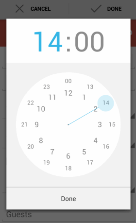
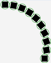
Recently I upgraded to a new phone and ran into this Android TimePicker, which I liked better than my slider UI. So I figured I would try and create something similar.
The first thing that is needed to create a UI like this, is to layout nodes in a circle. That turned out not to be too difficult, but the implementation was very specific for the circular time picker I was working on. And I figured it would be nice if the circular layout was reusable, so I got side-tracked in creating CircularPane.
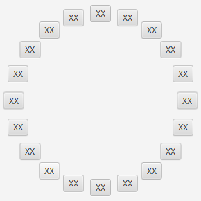
CircularPane is a standard JavaFX layout implementation that does nothing more or less than position its children in a (partial) circle, like the JavaFX Buttons example below:
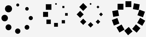
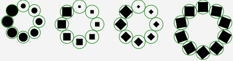
Of course any node can be placed in a circular layout, the example below has some (rotated) primitive shapes:
As soon as the nodes are getting more diverse, it becomes less clear if they are placed neatly in a circle. To visualize this better, CircularPane has a debug mode, where it will draw (in this case green) circles around the space allocated to each child:
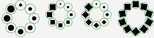
These circles visualize the layout logic; CircularPane searches for the largest node in its children, and uses that as the basis for the layout. The rectangles in the second and third CircularPane are a good example.
As soon as the largest child has been found, it is used to determine the smallest circle where all children can be placed on, assuming each child has the same space available as the largest child.
Besides using a full circle, it is also possible to instruct CircularPane to place its children in a partial circle, or an arc:
Of course a larger diameter circle is needed to place these nodes, but the empty space is automatically clipped away.
Often when a circular layout is used, the nodes being laid out are also shaped as a circle. This allows the nodes to be visually easily positioned anywhere on the circle. But this fact allows for an optimization; nodes in JavaFX are rectangular, they have a width and height. A rectangle is the shape that fully uses a node’s available space. Not knowing what exactly is or will be drawn in a node, CircularPane must assume that any node might use all of its space, so the debug circles encompass the rectangle by basing their size on the diagonal. This can clearly be seen in the second example. But the first example shows that for circular nodes room is wasted: even the largest circle has spare room.
So if all children are circular themselves, a more tight layout logic can be used, and the layout can be based on the width or height of the node instead of the diagonal. This is clearly visible in the first example below, where CircularPane was told that its children were all circular (or smaller):
With the recent popularity of wearable devices and especially Motorola announcing a round smart watch (the Moto 360, see below), a circular layout may just be what the doctor ordered. CircularPane currently is part of JFXtras-labs (8.0-r2) and will eventually move to JFXtras-layout, once all the tests and samples are in place.

Actually, the round smartwatch is from Motorola (Moto 360):
http://moto360.motorola.com/
Thanks for correcting! I’m pretty sure my source said LG, but maybe I got it mixed up with their G watch being mentioned in the same article.
Pingback: Java desktop links of the week, March 24 « Jonathan Giles
Pingback: JavaFX links of the week, March 24 // JavaFX News, Demos and Insight // FX Experience